We're another a few minutes away from commissioner
Mike Slive taking the dais for his SEC Media Days spiel. To kill some time, we'll grade the media guide covers. It's a tradition like no other (mostly because nobody bothers to rank things this irrelevant).
 Alabama: B.
 What's missing here? Got it yet? Huh? Yup, there's no mention of the fact that they're the defending national champions. None. For a school that triumphs its championship total (and counts them even if the claims to it are tenuous at best), this seems like an odd choice. I wonder if there's any regret of putting
Marcell Dareus on the front now that the NCAA is investigating whether he broke any rules by attending an agent's party in Miami. ANYWAY, I still like the design of the cover, especially the gray-on-gray, all caps Tide in the background. A solid effort.
 Arkansas: A.
 Now that's how you do it. No shame here. The Razorbacks have a Heisman Trophy candidate and they're going to promote the heck out of him by making him the cover boy of the media guide. I wish more schools would do this. If there's one player everybody in the country is clearly interested in, why go through the charade of putting three or four patsies on the cover with him? Nope, this is the way to go. Much better than seeing
Bobby Petrino out front.
 Auburn: B.
 An interesting take for a cover. Yes, there are a lot of pictures, but they're not the standard action cutout. And the photos aren't just of players. It's got slices of the Auburn gameday experience, with
Aubie, the stadium, a drum major, one of the eagles just chilling, etc. I'm more a fan of one primary picture to focus on, but this is an OK alternate.
 Florida: D.
 Too busy. They've got 10 --
10! -- different cutouts of players on the cover. I know they're probably trying to embrace the whole team thing after quarterback and occasional messiah
Tim Tebow garnered so much attention the last couple years, but this seems like overcompensating.
 Georgia: D.
 Weak effort, Bulldogs. I think they could have followed Alabama's lead last year and done a single-player cover.
A.J. Green is talented enough and the rest of the team low-profile enough for that to happen. Instead, we get this collage of players that features, of all things, a punter front and center. He might be a good punter, but you have to admit that's kind of weak.
 Kentucky: B.
 The Wildcats have a new coach in
Joker Phillips, so it makes sense that he's out front. They also have a standout player in
Randall Cobb, his appearance makes sense. But I like how they posed for the picture. It looks better than just doing an action cutout from a game. I'm not sure what to make of the "Operation Win" tagline at the bottom. I mean, the brainstormed and
that was the best they came up with?
 LSU: A.
 After a clownish design last year with too many pictures, a weird design and too much clutter, LSU got back to the basics. A big closeup picture makes this one pretty cool. (Although I don't know what "Number 1 Defense" says about the Tigers' confidence in a struggling offense this year). A good bounceback effort for LSU. This alone should get
Les Miles off the hot seat.
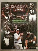 Mississippi State: D.
 A little too busy. You figure since this is
Dan Mullen's second year in Starkville that they could have bypassed using him on the cover again. The cutouts of key players is a media guide cliche. The only redeeming quality is the window-like view to the field in the background. Other than that, very standard fare, which is what you don't want.
 Ole Miss: A.
 I'm a fan of highlighting the uniform. It makes sense for the Rebels, who don't have a marquee player like
Jevan Snead to feature on the front. It's good that they didn't go with a cop out and put
Houston Nutt on the cover. This design shows off a pretty cool looking jersey and, as an added bonus, reminds you what year it is. I'm of mixed feeling about the "Rebelution" line at the bottom, though.
 South Carolina: D.
 A little boring. I guess it's sign of progress that the Gamecocks aren't still featuring
Steve Spurrier as their main attraction. But these are five pretty standard cutouts. The players aren't even doing anything interesting. They're just standing there. I think they should have just gone with a closeup shot of a visor sitting on a table. That would have gotten the message across.
 Tennessee: B-.
 The Vols get docked points for having the landscape style of guide. It makes it awkward to stack them. But I like the design. It's simple and stresses the program, not the head coach. I bet Tennessee wasn't going to get burned after the
Lane Kiffin fiasco after last season.
 Vanderbilt: C-.
 Very average design, with some very uninspired looking players on the front. (Is that their best mean face?) I do like that they call it a "Fact Book" at the bottom. A very forward-thinking way of calling a media guide. I expect nothing else from a school that abolished its athletic department. Also, good foresight by the Commodores to not feature
Bobby Johnson on the cover. Do you think anyone knew he would retire a week before SEC Media Days were set to begin?

 Alabama: B. What's missing here? Got it yet? Huh? Yup, there's no mention of the fact that they're the defending national champions. None. For a school that triumphs its championship total (and counts them even if the claims to it are tenuous at best), this seems like an odd choice. I wonder if there's any regret of putting Marcell Dareus on the front now that the NCAA is investigating whether he broke any rules by attending an agent's party in Miami. ANYWAY, I still like the design of the cover, especially the gray-on-gray, all caps Tide in the background. A solid effort.
 Arkansas: A. Now that's how you do it. No shame here. The Razorbacks have a Heisman Trophy candidate and they're going to promote the heck out of him by making him the cover boy of the media guide. I wish more schools would do this. If there's one player everybody in the country is clearly interested in, why go through the charade of putting three or four patsies on the cover with him? Nope, this is the way to go. Much better than seeing Bobby Petrino out front.
 Auburn: B. An interesting take for a cover. Yes, there are a lot of pictures, but they're not the standard action cutout. And the photos aren't just of players. It's got slices of the Auburn gameday experience, with Aubie, the stadium, a drum major, one of the eagles just chilling, etc. I'm more a fan of one primary picture to focus on, but this is an OK alternate.
 Florida: D. Too busy. They've got 10 -- 10! -- different cutouts of players on the cover. I know they're probably trying to embrace the whole team thing after quarterback and occasional messiah Tim Tebow garnered so much attention the last couple years, but this seems like overcompensating.
 Georgia: D. Weak effort, Bulldogs. I think they could have followed Alabama's lead last year and done a single-player cover. A.J. Green is talented enough and the rest of the team low-profile enough for that to happen. Instead, we get this collage of players that features, of all things, a punter front and center. He might be a good punter, but you have to admit that's kind of weak.
 Kentucky: B. The Wildcats have a new coach in Joker Phillips, so it makes sense that he's out front. They also have a standout player in Randall Cobb, his appearance makes sense. But I like how they posed for the picture. It looks better than just doing an action cutout from a game. I'm not sure what to make of the "Operation Win" tagline at the bottom. I mean, the brainstormed and that was the best they came up with?
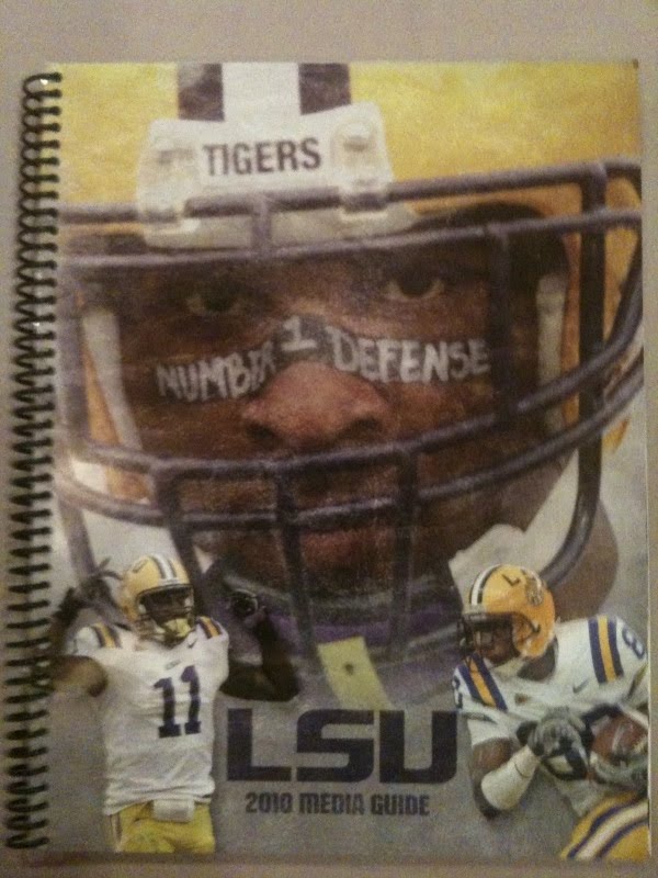 LSU: A. After a clownish design last year with too many pictures, a weird design and too much clutter, LSU got back to the basics. A big closeup picture makes this one pretty cool. (Although I don't know what "Number 1 Defense" says about the Tigers' confidence in a struggling offense this year). A good bounceback effort for LSU. This alone should get Les Miles off the hot seat.
 Mississippi State: D. A little too busy. You figure since this is Dan Mullen's second year in Starkville that they could have bypassed using him on the cover again. The cutouts of key players is a media guide cliche. The only redeeming quality is the window-like view to the field in the background. Other than that, very standard fare, which is what you don't want.
 Ole Miss: A. I'm a fan of highlighting the uniform. It makes sense for the Rebels, who don't have a marquee player like Jevan Snead to feature on the front. It's good that they didn't go with a cop out and put Houston Nutt on the cover. This design shows off a pretty cool looking jersey and, as an added bonus, reminds you what year it is. I'm of mixed feeling about the "Rebelution" line at the bottom, though.
 South Carolina: D. A little boring. I guess it's sign of progress that the Gamecocks aren't still featuring Steve Spurrier as their main attraction. But these are five pretty standard cutouts. The players aren't even doing anything interesting. They're just standing there. I think they should have just gone with a closeup shot of a visor sitting on a table. That would have gotten the message across.
 Tennessee: B-. The Vols get docked points for having the landscape style of guide. It makes it awkward to stack them. But I like the design. It's simple and stresses the program, not the head coach. I bet Tennessee wasn't going to get burned after the Lane Kiffin fiasco after last season.
 Vanderbilt: C-. Very average design, with some very uninspired looking players on the front. (Is that their best mean face?) I do like that they call it a "Fact Book" at the bottom. A very forward-thinking way of calling a media guide. I expect nothing else from a school that abolished its athletic department. Also, good foresight by the Commodores to not feature Bobby Johnson on the cover. Do you think anyone knew he would retire a week before SEC Media Days were set to begin?
8 comments:
Is there more than one edition of the Bama media guide? Last year they had similar covers with a series of different players, if I remember correctly.
They probably do. That was the only one I saw, though. There's still no mention of the national championship on any of them, though.
He's holding the crystal ball. I'd count that as a "mention".
More thoughts:
- Florida's is horrible. It looks like some kid just learned how to work photoshop.
- Ours is just ok. It looks like they couldn't decide what to do so they just stuck every picture they could find on there.
- I can't believe I'm about to type this but I like the subtleness of the Alabama player holding the crystal ball. "Alabama" and "subtle" aren't two words you see in the same sentence much.
You are correct about the crystal ball. That's a mention.
But it's not explicit. I expected it to be in big, bold type.
Count me pleasantly surprised that Bammer kept it subtle. I think it's a nice touch.
AB-
The line about LSU's "that alone should get Miles off the hot seat" cracked me up. This whole post/commentary was awesome.
I like Auburn's. I think they nailed the font and making the pictures part of the background. The one prominent photo concept is better if done correctly, but Auburn's is a nice break from the norm.
Ole Miss' would be the best if they didn't have that clutter at the bottom. Just the jersey and a title would have been tight.
Arkansas has the concept right, but I wouldn't say it looks cool.
Nothing ruins a great photo more than slapping a giant 'T' on it. I guess the folks who brought us traffic cone orange aren't going to suddenly start being tasteful.
Bama's is pretty solid and uncharacteristically subtle as some of you have pointed out.
LSU probably wins. Great use of single photo. They could have even dropped the two cut outs.
Kentucky is ok. They have nothing to be ashamed of.
Everyone else is pretty weak.
Post a Comment